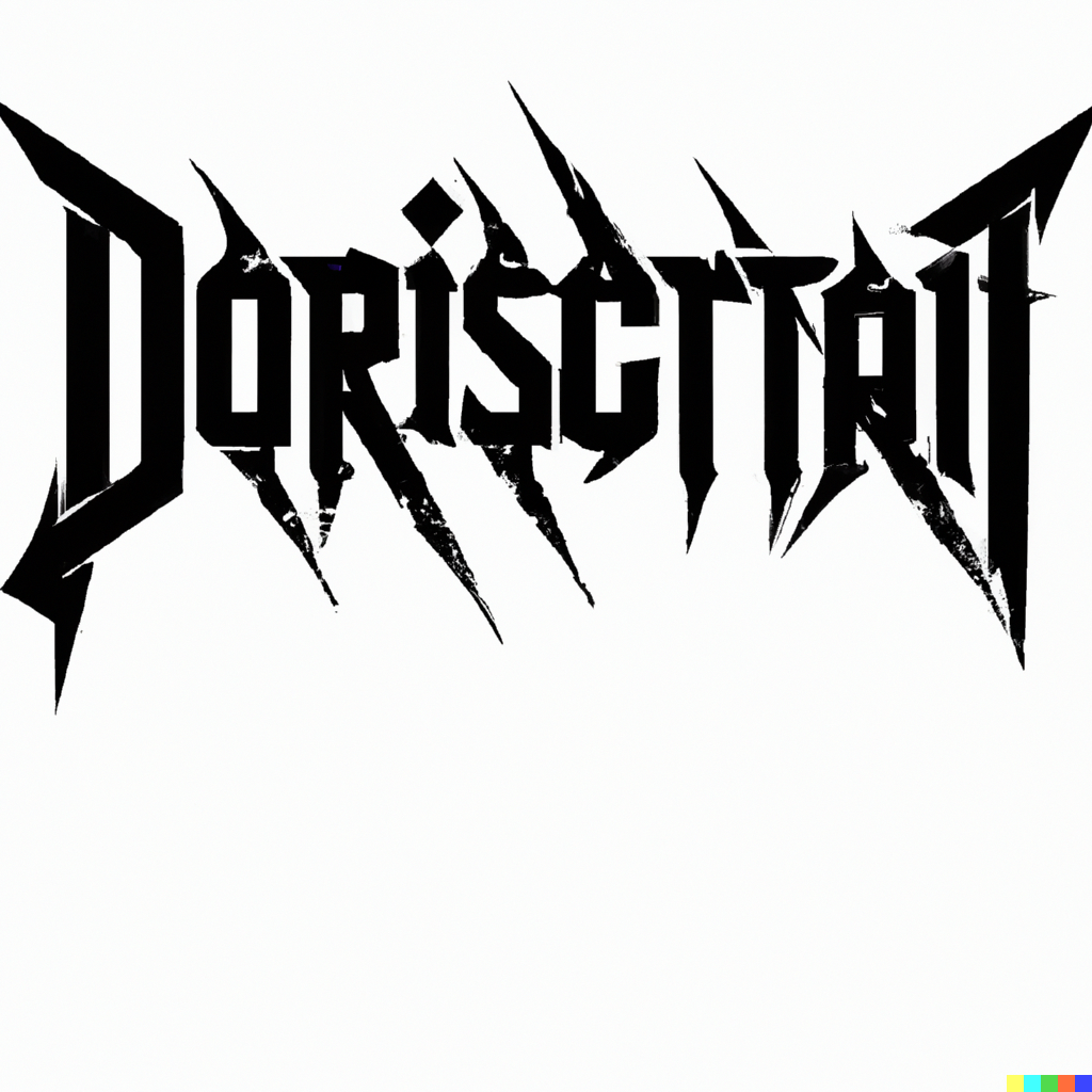
A popular deathcore band has been rejected by the scene for its excessive use of legible font on its logo.
The band, which cannot be named for legal reasons, had been making waves in the local circuit with its unique blend of deathcore and metalcore. However, it was their controversial logo design that ultimately caused their downfall.
The logo design featured a bold font that was legible enough to be read from across the room. This was seen as a major faux pas in the scene, which is renowned for its illegible logos and general distaste for “readability”.
Leaders of the deathcore scene have spoken out against the band, saying that their logo was “not deathcore enough” and that it was “too easy to read”.
The band has since responded to the criticism, saying they were trying to make a statement and express their individuality. They also said they were disappointed in the deathcore scene’s lack of open-mindedness and willingness to accept different styles.
It remains to be seen how the band will fare in the aftermath of this controversy, but it is clear that the scene has made its stance clear: legible logos are not welcome.


